
Burn down chart, also known as the Sprint Burn down chart, is a popular tool in managing the progress of a Scrum team. Let’s take 5 minutes to learn how to analyze and apply this chart!
The structure of a Burn down chart is essentially a graph that summarizes the progress of a Scrum team’s work, aiming to measure the actual completion progress against the expected progress. Specifically:
- Y-axis: shows the total workload that the Scrum team needs to complete to achieve the Sprint Goal. The usual unit of measurement is story points, estimated man-hours, or man-days.
- X-axis: the number of working days in the Sprint.
- Expected line: the expected progress per day to achieve the Sprint Goal.
- Actual line: the actual progress that the Scrum Team has achieved each day.
To illustrate further, let’s take a look at the example below:
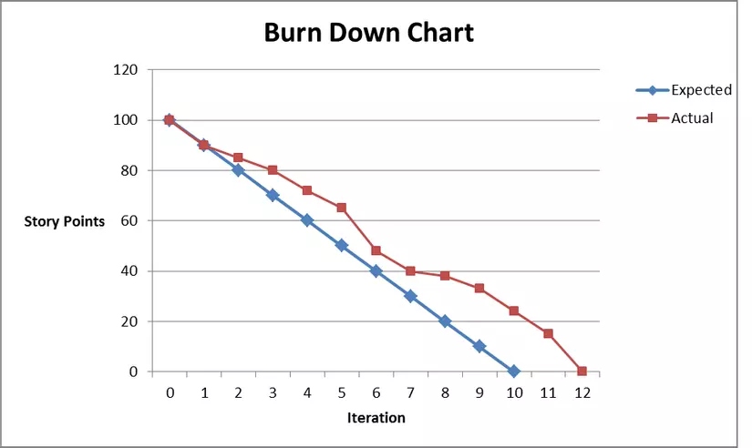
Through monitoring the chart, the Scrum team will obtain information on:
- Number of story points completed in the Sprint
- Actual progress being faster or slower than expected
- Amount of remaining story needed to complete the Sprint.
How is the Burn down chart applied?
The analysis of the Burn down chart is very simple: the Actual line will run to 0 when the project is completed. Typically, the Scrum Master and Product Owner directly monitor the Burn down chart to manage progress in the team and update the product release plan. Below are the main applications of this chart:
Plan and monitor work progress
The Burn-down chart provides daily work progress, indicating what the team has done and how to work with the progress to achieve the Sprint goal. On the other hand, it is also a risk alert tool when work is not progressing as expected.
Update project progress with customers
Thanks to its visual, transparent, and easy-to-understand nature, the Burn down chart will be helpful in presenting project progress to customers. It can show customers that the team is meeting the progress correctly or is behind schedule due to many newly added tasks.
Does the Burn down chart have any disadvantages?
Limited information
The Burn down chart only shows the number of stories that have been completed, however, it does not indicate any changes in the Product Backlog. Only completed or uncompleted tasks are shown on the chart; tasks in progress are not displayed. Therefore, it can sometimes lead to a discrepancy between expectations and the team’s actual ability.
Inability to represent work efficiency
The Burn down chart provides work progress, but it cannot show whether the team’s work is going in the right direction or not. Generally, it is seen as a trend forecasting tool. To accurately evaluate the team’s performance, we need to combine it with other techniques as well as important meetings such as retrospectives and improvements.
What is a Burn up chart?
If the Burn down chart shows the amount of remaining work to be done in the project, then the Burn up chart shows how much work has been completed and the total amount of work. In other words, it is a different form of representation to help viewers have an overview of the expected time needed to complete a project.
When making a product, it is not uncommon for customers to request additional features – thereby adding new items to the project. At this point, the Burn up chart will help the team know how adding new items affects the project deadline. At the same time, customers will also be aware of the progress, from which they can consider whether they really need those additional items or not
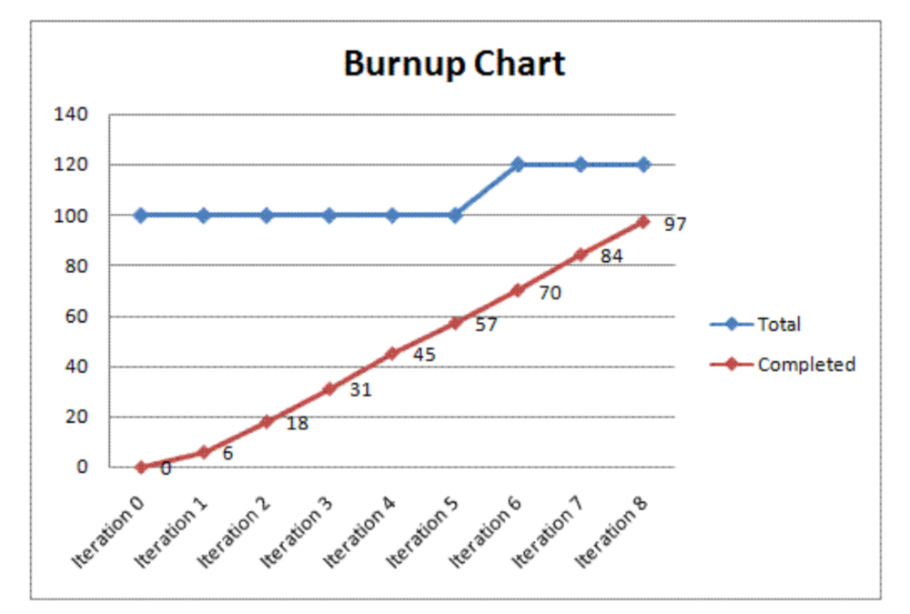
Chart description:
- Y-axis (vertical axis): the number of stories/tasks in the project.
- X-axis (horizontal axis): the project timeline or estimated time to complete the project.
- Blue line (total): the total amount of work to be completed over time. Here, we can see that the initial amount of work was 100 and has increased to 120.
- Red line (completed): the amount of work that has been completed.
Overall, both Burn down and Burn up charts are types of charts that help manage and track the progress of a Scrum team’s project. Depending on the context, we can apply the appropriate type of chart to identify solutions to improve progress and shorten the time to complete project goals.
Read related article: What is Velocity in Agile methodology?